Please register to participate in our discussions with 2 million other members - it's free and quick! Some forums can only be seen by registered members. After you create your account, you'll be able to customize options and access all our 15,000 new posts/day with fewer ads.
Quite the comprehensive plan for the North (white) side of Atlanta but very little in the South (black) side.
Quote:
Originally Posted by skbl17
(Originally posted in the "Design your own MARTA expansion" thread on the Atlanta forum, but I thought I'd share it with the C-D urban planning crowd.)
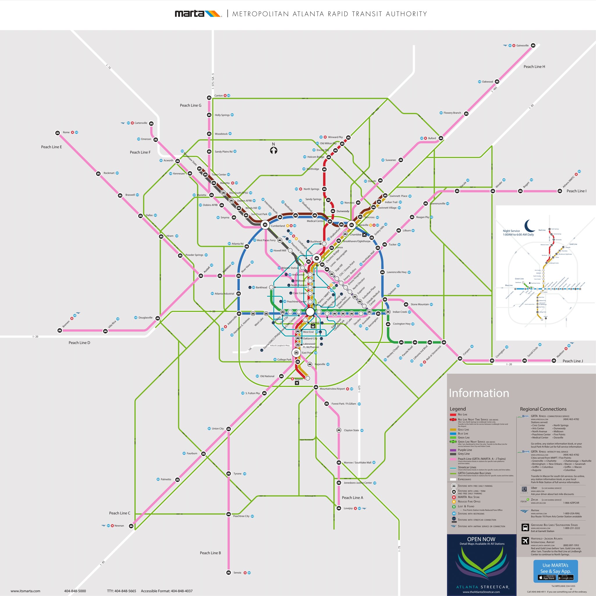
Back in January or so of this year, I created a hypothetical map for MARTA expansion in the greater Atlanta area. In case you don't know, MARTA is the sole heavy rail and primary bus operator in three counties (Fulton, DeKalb, and Clayton), and alongside the suburban bus systems (CCT and GCT) and the commuter bus operator GRTA, provides a...somewhat tolerable...transit system for metro Atlanta. Anyway, I made a map for reasons.
This does not show any hypothetical commuter rail system or the active Atlanta Streetcar system (which has its own slew of expansions in planning), but those would be there too!
- Red Line: Extended from North Springs to Windward Parkway. In real life, this extension is already very far in the planning stages, but is missing funding. All heavy rail.
- Gold Line: Extended from Doraville to Sugarloaf Parkway, and from East Point (where it breaks off from the Red Line) to Jonesboro. In real life, the former extension is dependent on the ascension of Gwinnett County to MARTA, and the latter extension is in the planning stages. All heavy rail.
- Blue Line: Extended from Hamilton E. Holmes west to Thornton Road, and from Indian Creek to Stonecrest Mall. In real life, the former extension (beyond Fulton Industrial) is dependent on the ascension of Cobb County to MARTA, and the latter is very far in the planning stages, but is missing funding. All heavy rail.
- Green Line: Extended from Bankhead to Tucker, with an infill station added at Boone Blvd. in west Atlanta. All heavy rail.
- Orange Line: A new line, traversing from Lindbergh Center (where it meets with Red and Gold) to Avondale (where it meets with Blue). In real life, this line is already in the planning stages, but is currently planned as light rail. This map assumes heavy rail.
- Navy Line: A new line, traversing from Smyrna to Doraville (where it meets with Gold). In real life, this line is dependent on the ascension of Cobb County to MARTA, but it has been talked about at least in part by anti-congestion advocacy groups. This map assumes heavy rail.
- Magenta Line: A new line, traversing from Arts Center in midtown Atlanta (where it meets with Red and Gold) to Kennesaw State University. In real life, this line is dependent on the ascension of Cobb County to MARTA, and the corridor has had various transit plans discussed in the past. This map assumes heavy rail.
Finally, there are also two BRT lines:
- North Loop: A bus rapid transit line that would run from Marietta (where it meets with Magenta) to Lawrenceville, generally following GA 120 most of the way. Again, in real life, this BRT line would be dependent on the ascension of Cobb and Gwinnett counties to MARTA.
- Stonecrest Express: A bus rapid transit line that would run from Five Points (where it meets with almost every line) to Stonecrest Mall, generally following I-20 most of the way. Some service does overlap with the eastern Blue Line extension.
This is about as "fantasy" as I could make a fantasy transit map.
Quite the comprehensive plan for the North (white) side of Atlanta but very little in the South (black) side.
Mostly to do with the density and population of the city and the transit patterns therein, and less to do with the color of the people who live there. The North side of the city is where a majority of the interstate/highway congestion is, as well as the large jobs centers that northern residents are moving between.
While there is transportation needs within the southside, they are greatly overshadowed by those in the northern part of the city in sheer mass and volume.
Describing the north side as "white" is not very accurate anymore. Gwinnett County, to the northeast is majority minority. Cobb County, to the northwest, will likely soon be.
I've drawn some maps for the Central Florida region (Orlando Metro area), also mostly centering around Orlando.
This is the Central Florida Regional Transit Authority: https://www.google.com/maps/d/edit?m...s&usp=sharing7
The Green line is the existing SunRail commuter rail system. The Orange Line is another heavy rail commuter system. The other lines are elevated subway type trains. The blue line has trains going in both directions, not just one loop. From the Downtown Disney stop, you would have trains going to "Orlando International Airport Express" and "Orlando International Airport via International Drive"
If you click on the station logo, you can see what transfers can be made at each stop. The bus routes are based on the current LYNX system, and some routes are the current numbers, and others I had to change when I combined two different bus systems
Last edited by Joke Insurance; 07-14-2015 at 12:23 AM..
Please register to post and access all features of our very popular forum. It is free and quick. Over $68,000 in prizes has already been given out to active posters on our forum. Additional giveaways are planned.
Detailed information about all U.S. cities, counties, and zip codes on our site: City-data.com.

 Please register to participate in our discussions with 2 million other members - it's free and quick! Some forums can only be seen by registered members. After you create your account, you'll be able to customize options and access all our 15,000 new posts/day with fewer ads.