Please register to participate in our discussions with 2 million other members - it's free and quick! Some forums can only be seen by registered members. After you create your account, you'll be able to customize options and access all our 15,000 new posts/day with fewer ads.
Care to break down the logistics of your alarmist math? Or have a study breaking it down?
"WE are probably only looking at...." <<< when you say "we" do you mean the planet or your panel of climatologists? lol
Of course it is conjecture, it is a prediction of the future after all.
That conjecture is based upon the 130 years of data that NASA published. The cooling period between 1880 and 1915 was more extreme than the cooling period from 1945 to 1980. However, between the two cooling periods there was a grand total of 0.29°C decrease. Therefore, if we truly are going into another cooling period, temperatures over the next 30 to 35 years should cumulatively drop by ~0.145°C on average.
Granted two prior cooling periods and two prior warming periods covering 130 years is not much data to base a trend on, but that is all the data we have.
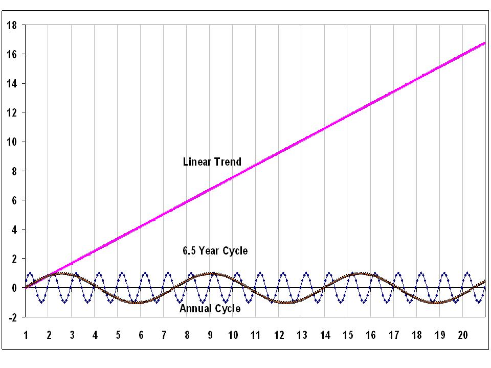
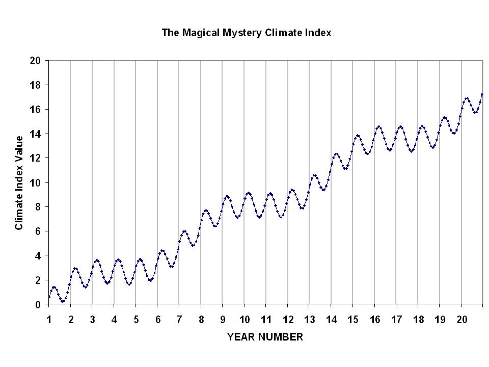
Here's two graphs that represent the exact same data, cyclical or increasing with time?
You're too easy.... the term cyclical means a repetitive cycle. What is confusing with the graph in the other post is how it's represented becsue it could easily be redrawn to show a repetitive cycle.
Here's two graphs that represent the exact same data, cyclical or increasing with time?
You're too easy.... the term cyclical means a repetitive cycle. What is confusing with the graph in the other post is how it's represented becsue it could easily be redrawn to show a repetitive cycle.
What is your point? The temperature is rising and the sea level at the battery tide station has risen at a rate of 2.77 mm per year since 1856....
Here's two graphs that represent the exact same data, cyclical or increasing with time?
You're too easy.... the term cyclical means a repetitive cycle. What is confusing with the graph in the other post is how it's represented becsue it could easily be redrawn to show a repetitive cycle.
The Mean Sea Level graph also matches the cooling and warming cycles in NASA's data. During the two 35-year cooling periods, sea levels dropped at the Battery, NY. During the two 30-year warming periods, sea levels increased at the Battery, NY. The net result may be an overall increase in sea levels, but there are definite cycles that match global temperature changes during the same period.
The Mean Sea Level graph also matches the cooling and warming cycles in NASA's data. During the two 35-year cooling periods, sea levels dropped at the Battery, NY. During the two 30-year warming periods, sea levels increased at the Battery, NY.
The second graph does not indicate a drop in sea level, what it shows is the increase and decrease of the rate at which it's rising. For example for the period of 1960 to 2010 it's not quite rising as fast as it was between 1925 and 1975 but it's rising faster than it was between 1955 and 1995. What's confusing about it is the mean from the entire period is a flatlline. Each point is the a 50 year mean plotted against the mean for the entire duration.
The second graph does not indicate a drop in sea level, what it shows is the increase and decrease of the rate at which it's rising. For example for the period of 1960 to 2010 it's not quite rising as fast as it was between 1925 and 1975 but it's rising faster than it was between 1955 and 1995. What's confusing about it is the mean from the entire period is a flatlline. Each point is the a 50 year mean plotted against the mean for the entire duration.
I do not find it confusing at all. NASA's data shows the same thing; a grand total increase of 0.80°C between two 30-year warming periods from 1880 to 2010, and a grand total decrease of 0.29°C between two 35-year cooling periods from 1880 to 2010. Which would give it a mean temperature increase of 0.51°C over the 130 year period.
Please register to post and access all features of our very popular forum. It is free and quick. Over $68,000 in prizes has already been given out to active posters on our forum. Additional giveaways are planned.
Detailed information about all U.S. cities, counties, and zip codes on our site: City-data.com.

 Please register to participate in our discussions with 2 million other members - it's free and quick! Some forums can only be seen by registered members. After you create your account, you'll be able to customize options and access all our 15,000 new posts/day with fewer ads.