Please register to participate in our discussions with 2 million other members - it's free and quick! Some forums can only be seen by registered members. After you create your account, you'll be able to customize options and access all our 15,000 new posts/day with fewer ads.
ME..On 1 of your pic that you posted ...frog. I got the inpression that you were too far away then cropped to close it fuzzed out. I did that a lot whan I 1st got my camera....
Okay... so I guess I should ask too then, Anyone with advice for me?
What could/should have been done with my shot from the photo contest?
Fed,
The trees in your photograph are what distracted me. As soon as I view it my eyes go right to the trees and look through the opening. (which I belive is why they are there) They took the architecture out of the photo.
me, I think the only thing that distracted for me was the glare at the middle through the opening that made me squint at your photo, but I really liked the idea of it, and the beams and thought it a very interesting shot.
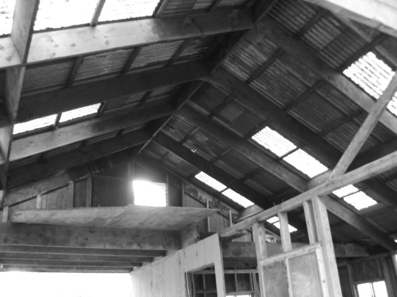
katie, I think you did the same mistake I did which was to try to get the whole building in and being a bit too far away so you really can't get the essence of the building itself. I felt it wasn't as distinct and clear as it could have been. (and no worries I did the same dang thing with mine, I just couldn't resist the little doggie in the corner of the picture that I wanted to keep in there :-) so I chose that one instead of the closer shots)
Fedup, I enjoyed your photo very much and the trees did not distract for me they added more interest. I thought it well done. I'd be interested to see the difference with b&w.
I think everyone did a fabulous job this round, and I am looking forward to the next challenge. And congratulations to our movers-on.
Matt, I sometimes forget that I'm sharing with people not from my own neighborhood. This casino/building is in the middle of a Freddrick Law Olmstead park. Mostly all of its design (all the way around) is of looking through, for that reason is how I lined up my picture.
For this reason as well is why I had not opted for B&W, because the green of the grass and the red of the bricks.
But here's the suggested B&W, thoughts? Which one is better? (any other advice is most appreciated)
Please register to post and access all features of our very popular forum. It is free and quick. Over $68,000 in prizes has already been given out to active posters on our forum. Additional giveaways are planned.
Detailed information about all U.S. cities, counties, and zip codes on our site: City-data.com.

 Please register to participate in our discussions with 2 million other members - it's free and quick! Some forums can only be seen by registered members. After you create your account, you'll be able to customize options and access all our 15,000 new posts/day with fewer ads.


 This casino/building is in the middle of a Freddrick Law Olmstead park. Mostly all of its design (all the way around) is of looking through, for that reason is how I lined up my picture.

