Please register to participate in our discussions with 2 million other members - it's free and quick! Some forums can only be seen by registered members. After you create your account, you'll be able to customize options and access all our 15,000 new posts/day with fewer ads.
I like logos/jerseys that are simple and effective, like Montreal, Flyers, Lightning, Calgary for example.
but
Rangers/Devils/Bruins. Too Simple.
Avs, Wild, capitals, black hawks. Too cluttered
and Ducks and the Buffa-Slugs, . . . worst logos of all time.
Buffalo deverves a better logo ! !
Montreal, philly, and Calgary are awesome along with the rangers, Devils, and Bruins. Most of these teams made no changes or barely any over the years... over decades. Ducks new one is stupid. They are no longer the Mighty Ducks they are "The Wimpy Ducks" as a kid from the Mighty Ducks movie would say lol and i hope you mean the Sabres logo is stupid. Everyone in Buffalo hates it. We wanted the original one back. The Original.
some nice jersey/ logo ideas. Take Jersey with logo we got a kick ass jersey and classic and original
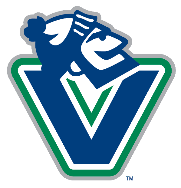
Vancouver always has outrageous jerseys.
MTL was historic, probably pre 1900 and you have to respect that, . . . BUT
I agree, . . . those Dallas Jerseys and Logos are UGLY!! What were they thinking ??!?!?
Idk what Vsncouver or Dallas were thinking when they did those Jerseys. Man i thought Buffalo had a bad one. What do these teams do? get the worst thinkers in the world to create new jerseys? God this is embarassing. teams constantly changing jersey logos and crap. Well knock on wood just be glad they don't have any sponsor logos on them like in Europe.
Generally speaking, the Original 6 have the best sweaters and logos in the league. Mainly because they're simple in look and color scheme, plus their is history with those logos. So here is my list of the 10 best NHL uniforms, outside of the Origninal 6.
10-Pittsburgh Penguins-there is a reason why they won all their cups with the "skating penguin". The hockey gods will not let a team sporting those hideous "pigeon" jersey win a Cup, no matter how many goals Jagr and Lemieux score.
9-Washington Capitals-Love the homage to DC with the three red stars
8-Buffalo Sabres-NOT the slug, but their 3rd jersey's-how can you turn back on the "leaping buffalo"
7-Philadelphia Flyers- it's like an Original 6 logo it's simple
6-St Louis Blues-you can't go wrong with the "blue note". Also on their 3rd jersey is sweet with the Gateway Arch
5-Calgary Flames-Simple and sweet looking. I prefer the current ones to the ones they wore in 1989. However, do they need the flags. I know Alberta is often mocked as the "51st state", but really.
4-Ottawa Senators-This logo has grew on me. A little cartoonish, but still it's pretty cool. Also I like the homage to the Original Senators.
3-Los Angeles Kings-It is kind of a mix between the old purple and gold sweaters of the 1970's and 1980's, and the black ones of the Gretzky era.
2-Minnesota Wild- When I first heard the new Minnesota team was going to be called the "Wild" I thought it was dumb. However the name has grew on to me. And I really dig the Red jerseys.
1-Edmonton Oilers- I always liked their uniforms, too bad they don't play as good as they look.
Amen to that with Edmonton lol Ottawa i hate them period. sorry. Sabres you mean the one with the retro logo? Calgary's is sick and Philly is classic along with St. Louis
Please register to post and access all features of our very popular forum. It is free and quick. Over $68,000 in prizes has already been given out to active posters on our forum. Additional giveaways are planned.
Detailed information about all U.S. cities, counties, and zip codes on our site: City-data.com.

 Please register to participate in our discussions with 2 million other members - it's free and quick! Some forums can only be seen by registered members. After you create your account, you'll be able to customize options and access all our 15,000 new posts/day with fewer ads.


 and Philly is classic along with St. Louis
