Please register to participate in our discussions with 2 million other members - it's free and quick! Some forums can only be seen by registered members. After you create your account, you'll be able to customize options and access all our 15,000 new posts/day with fewer ads.
1970's Atlanta Hawks Maravich era lime green unis.
Cleveland Indians 1970's big red blob unis.
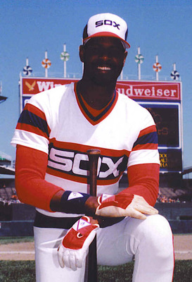
By the way, if your a baseball fan and haven't read Bill Veeck's auto bio "Veeck as in Wreck", your missing out. Mr Veeck was an original, despite the 1976 White Sox softball uniforms.
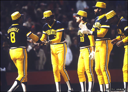
Taste is subjective.. we all have differing opinions on what looks good.. but I think the 70s Pirates had unusual uniforms..
Toronto chose an unusual mascot for their NBA franchise.. and then it seemed even more unique to see a dinosaur dribbling a ball on their 90s jerseys.. Kinda hard to see, but there were claw marks/tears on the sides..
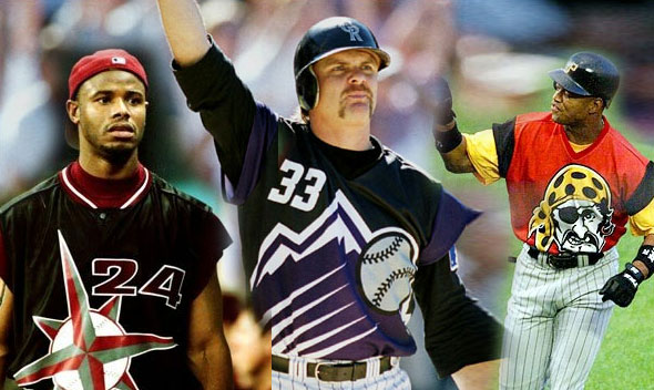
Commenting on some of the other unusual ones.. I like the Nolan Ryan-era Astros jersey. I think the stripes (in different shades of orange) were cool. But I didn't like most of the late 90s alternate NHL looks.. When the Sabres dropped their crossed swords & the Islanders had their Gorton's fisherman guy.. Glad the traditional looks returned.
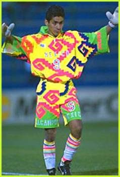
If I remember correctly Campos designed his own jersey, all of them where bloody awful. Id hate to see what colour he painted his house ...
David Seaman had a terrible jersey too
Please register to post and access all features of our very popular forum. It is free and quick. Over $68,000 in prizes has already been given out to active posters on our forum. Additional giveaways are planned.
Detailed information about all U.S. cities, counties, and zip codes on our site: City-data.com.

 Please register to participate in our discussions with 2 million other members - it's free and quick! Some forums can only be seen by registered members. After you create your account, you'll be able to customize options and access all our 15,000 new posts/day with fewer ads.